Design of Logos, visual identity and UI
for games and beyond
Design is an important field to elevate the development of games, apps and products. I aim to showcase my expertise in this area with following projects.
Is common to say something like "the union of form and function" or use terms like Visual Communication, Composition and Layout. Design has many competing doctrines, but can not be framed as a Science. The soo called norms work more like guidelines than rules. I have expanded my skills toward Design, as it is a field close to visual creation and media art. I've done an Udemy Course about logo design and attended several classes at my college about the topic, complemented by a lot of self learning. This is an area I am still learning and I hope you find interesting what I have achieved soo far.
Cubos is a game engine being developed internally at GameDev Técnico. Its main focus is to allow for performant voxel rendering while maintaining the features we are used to with mainstream game engines. Other planned features include vast render distances and the destructability of objects by taking advantage of the voxel system.
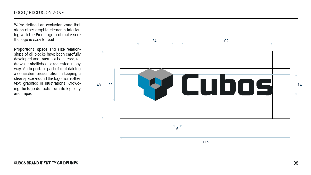
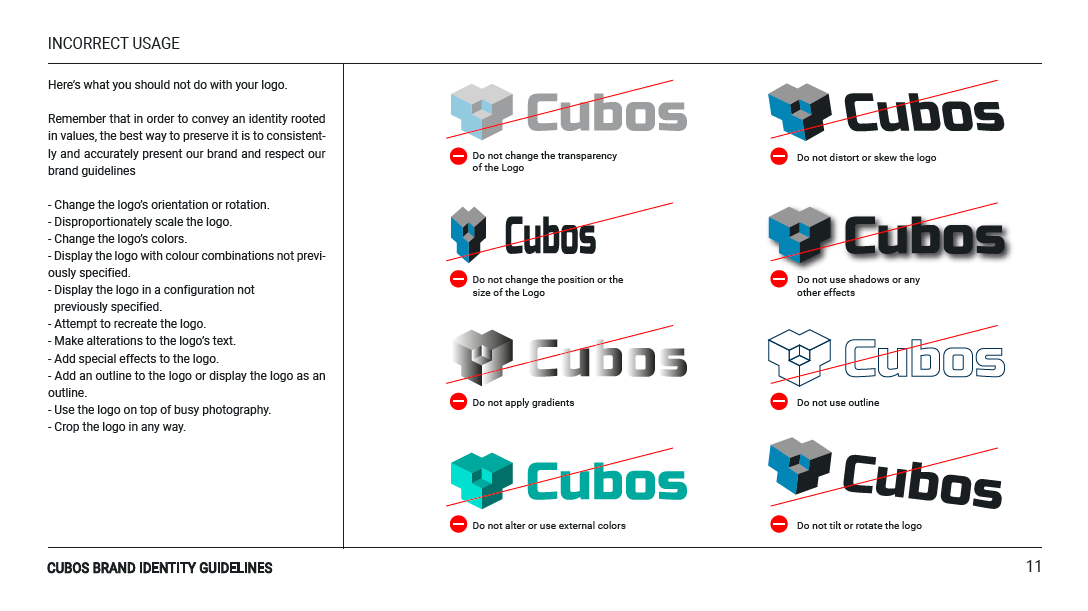
Cubos had grown out of its cocoon and needed new wings to fly out of its embryonic phase. The new visual identity aimed at providing a more cohesive and professional look to an increasingly defined and completed game engine. A new logo was designed, alongside a set of visual rules and principals that form Cubos new identity.
The process started with the logo. The team wished to keep the 3D aspect of the former logo, but with a more slick and modern twist. Furthermore, as the project was aimed at a software (a game engine), an icon was necessary for the application, the branding the launch screen, etc. A stylized word-mark, like the previous version, was insufficient. So we set to design the icon. At first, the design followed a more intellectual and less literal approach, adapting an isometric view with 3 sides to establish a deconstructed view of a Cube. The concept of this design was to incorporate the movement and change in the symbol, while representing the assembly purpose of a game engine. In this case, the assembly of a cube, with is faces at the moment they are sliding into place.
The team received this design with mixed feelings. The logo had little of the 3D aspect that made their previous logo and that also constitutes the main selling point of the engine - voxel base game engine. Therefore, we jumped to a second design, that retained the original while representing a shape made of literal isometric cubes. The final shape was a 3-armed spiral, inspired by the Celtic symbol the Trisquel, without copying the Trisquel GNU/Linux software.
Unfortunately, to some members of the team, the new icon reminded them of some unpleasant symbol. Consequently, we're back to square one. A brainstorming session ensued. Various shapes were tested and debated, but the icons kept getting too complex and unrecognizable.
Eventually, we arrived at an icon that was composed of cubes, that did not bring any bad connotations and that was relatively simple and memorable. As it can be seen in the experiment above, the spiral/movement idea was forsaken in favor of a greater emphasis in the assembly aspect. Three cubes merged to form something more complex, suggesting ideas of union and strength.
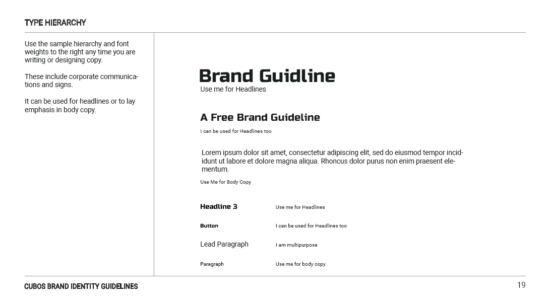
Parallel to the icon design process was the font selection. The goals we set at the start were that the font had to transmit a feel of modernity and a certain degree of formality, since those were the goals of this redesign, while conveying the slickness and dynamism of an innovative product. Other concerns that were considered were the versatility and rights of the chosen font. To address this last point, we opted for Google fonts library, a largely integrated and open-source collection of great fonts, that complements the open-source aspect of the project. The fonts selected were Russo One for the logo mark and displays/headers, and Roboto font family for text body. Russo One conveys energy and strength while maintaining a dynamic feel to it, while Roboto is a well-established in the space of tech and innovation.
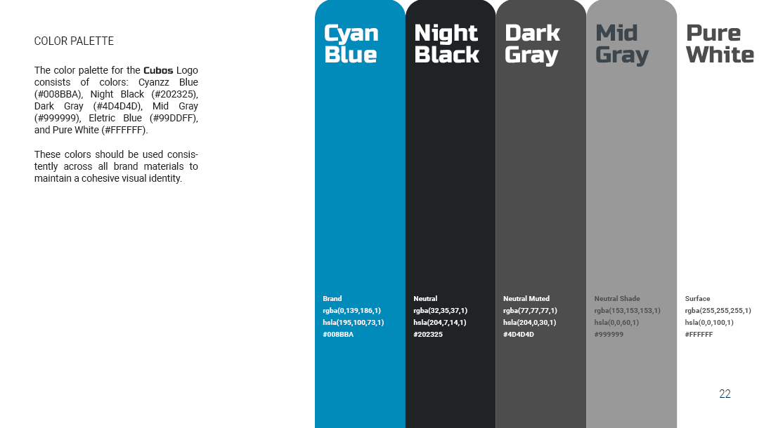
About the logo's colors, it can be observed that these remained virtually unchanged thought out the design process. The contrast of neutral colors with a cyan blue, that aim to represent knowledge and innovation, was well received. Additional colors were added to the pallet for software and marketing purposes. Speaking of which, a Brand Guidelines Document was enacted to specify how the brand and marketing material should be designed and to which principles it should adhere.

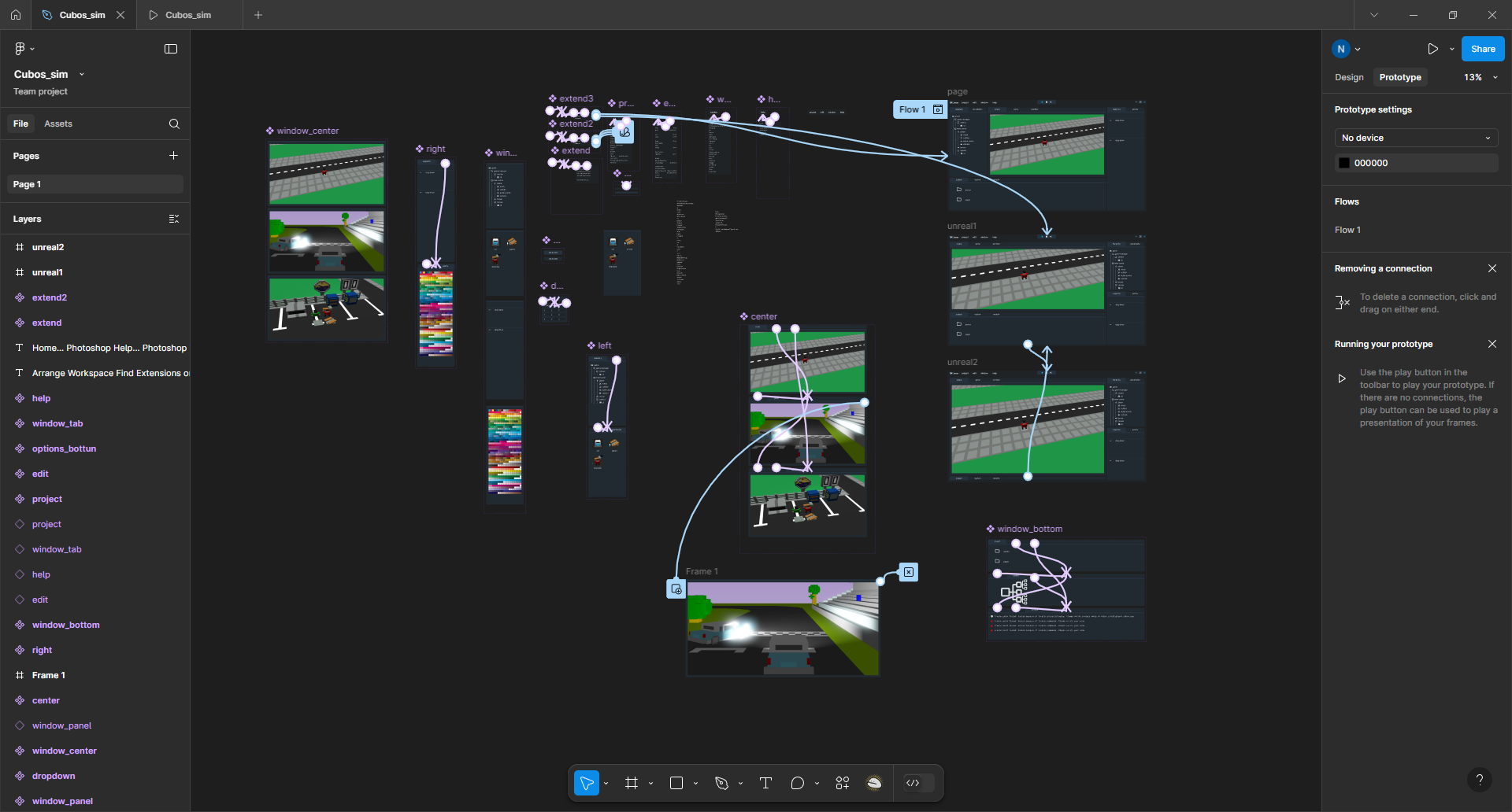
This Figma prototype explored the user interface for a new voxel-based game engine, focusing on simplicity and clarity without reinventing the wheel. While it drew inspiration from familiar patterns used in other engines, it avoided directly copying them, instead prioritizing a streamlined and intuitive experience tailored to voxel game development. The goal was to create an interface that feels natural to use, helping developers focus on building worlds rather than wrestling with complex tools.
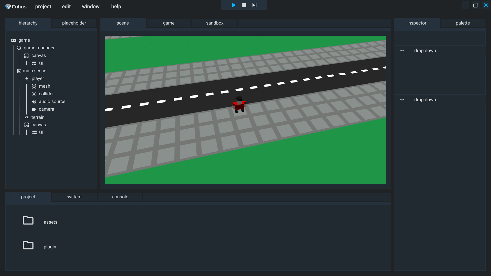
When the scene view is selected you can place and remove objects
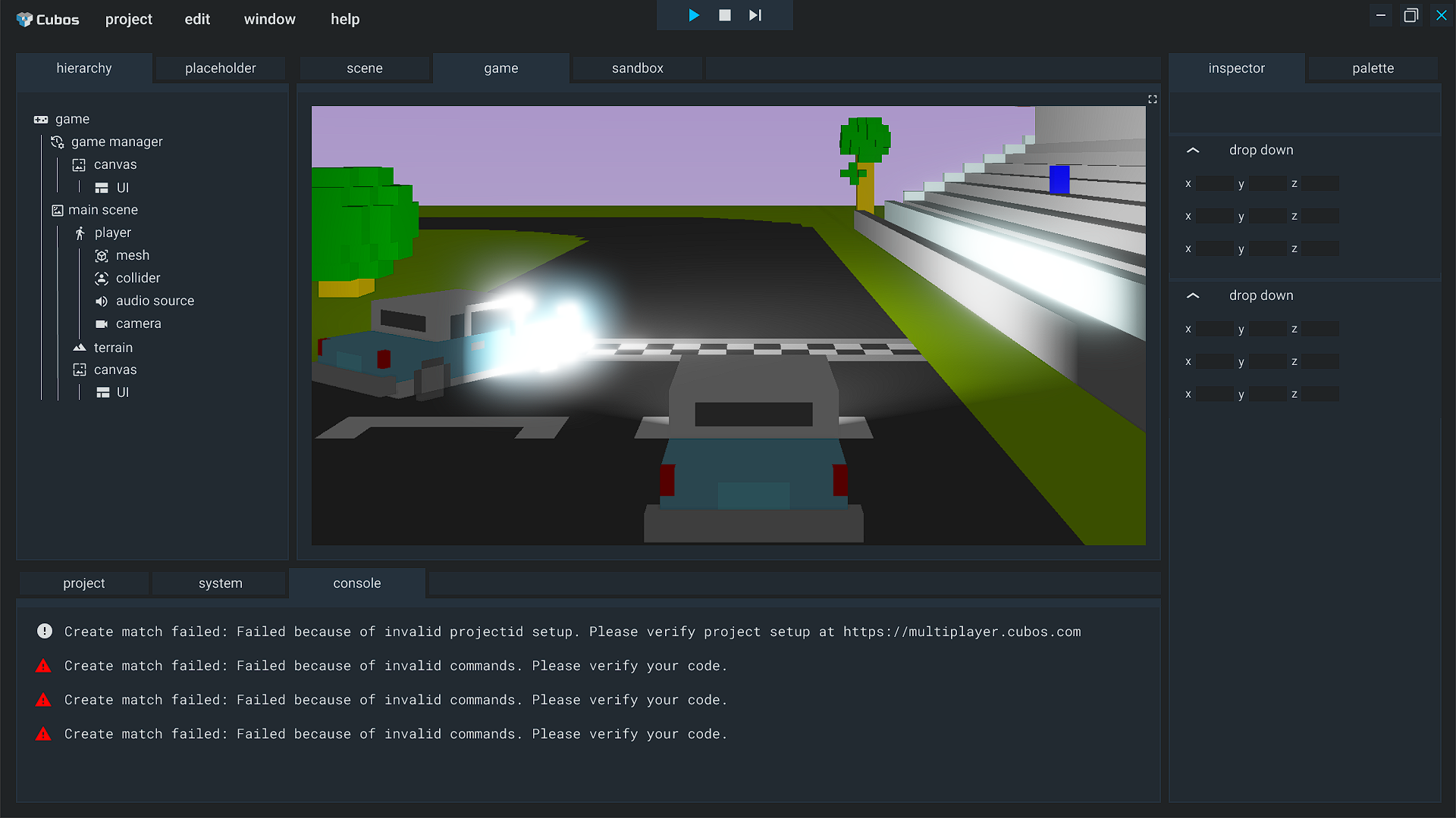
When the game view is selected, you can preview what the main camera is catching. Also when you press play it defaults to this view.
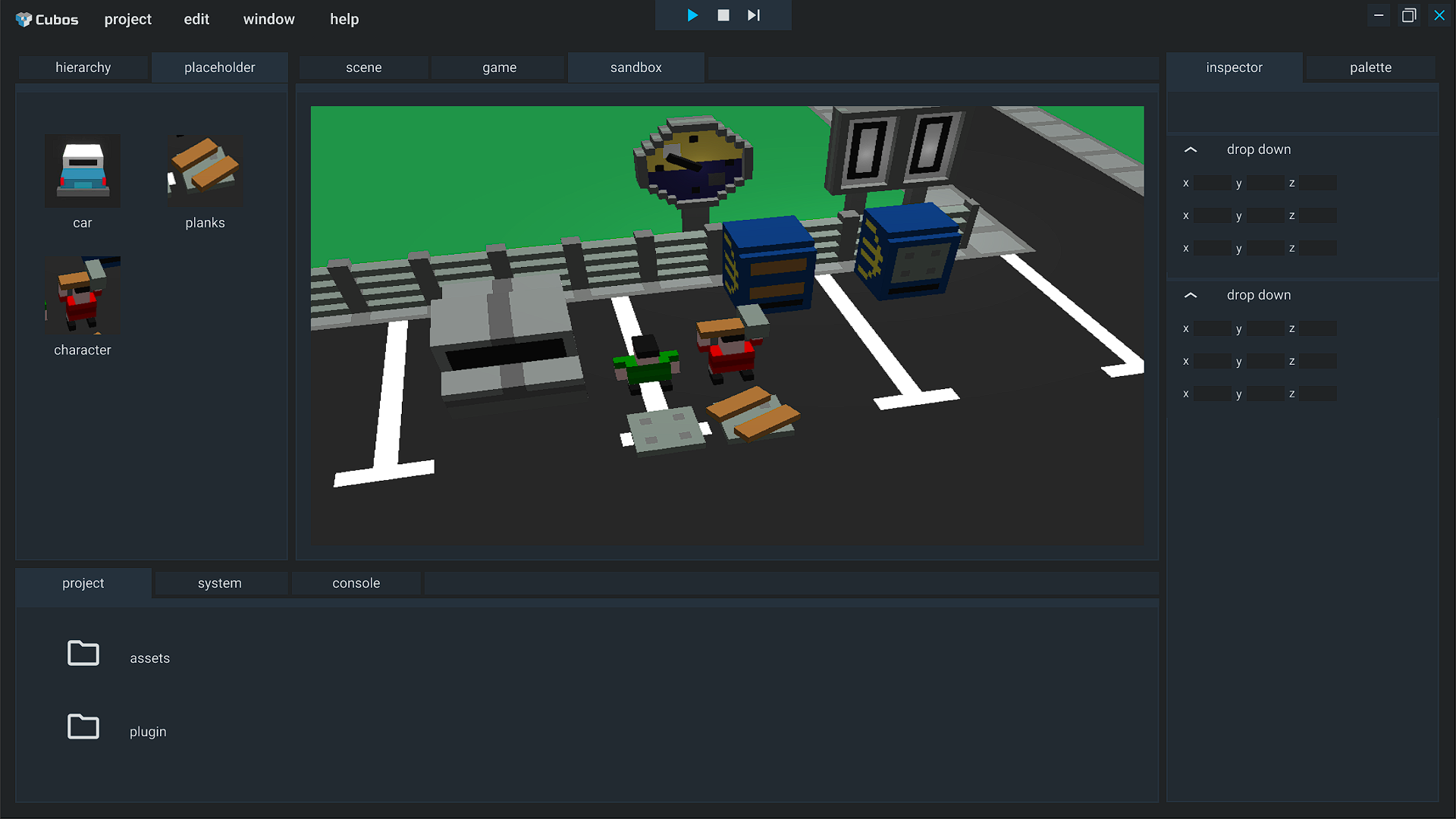
When the sandbox view is selected, you can edit voxels, like in a modeling app or like in Minecraft.
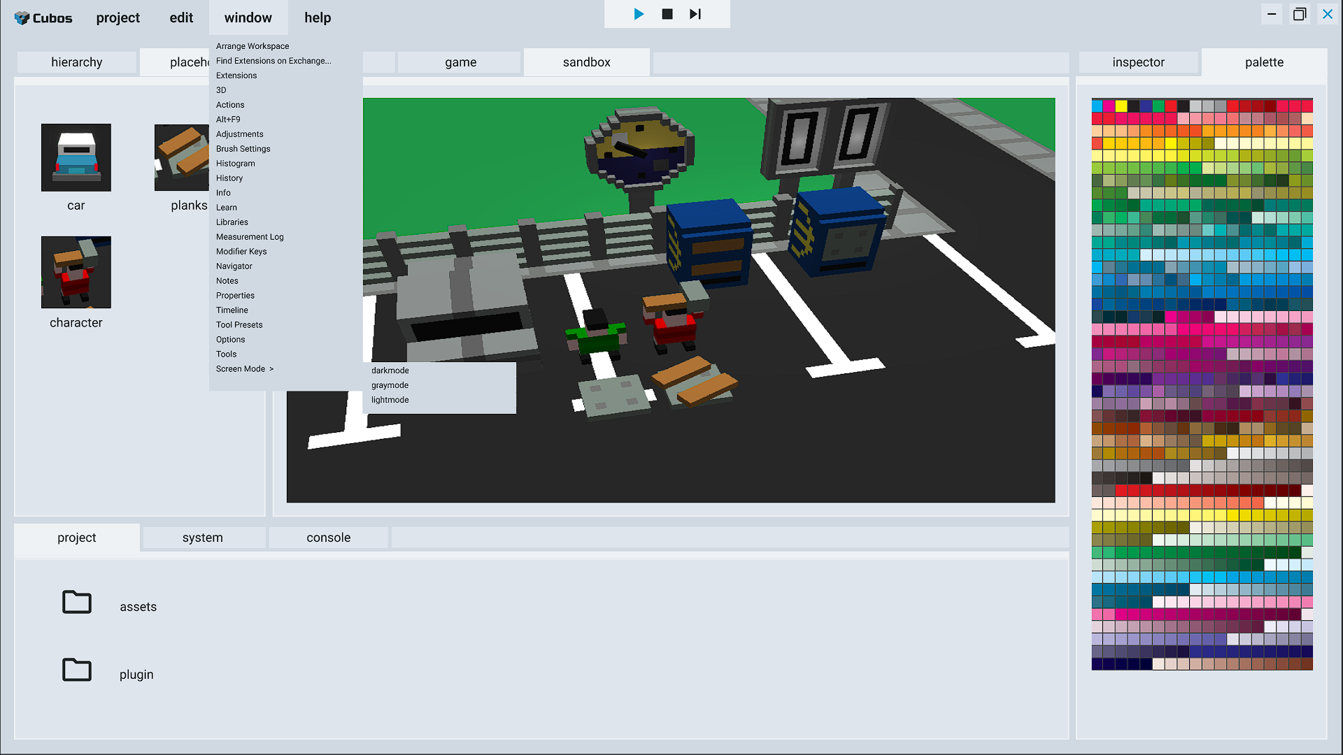
The design also accounts for light and dark modes, and a grey mode to restrict blue light
You can find more about Cubos Engine UI at its cubosengine.org.

The Brand Collateral was developed around the visual identity, but it used a more cathy color - orange, to satisfy the advertisement proposes of the recruitment campaign. This campaign had the objective of gathering new developers for the engine, and since the target audience was mostly young adults, the tone was adjusted to make the material look more enticing and fun. Careful care was taken for the compositing to succeed in dynamism and legibility, ideally guiding the viewer through the poster towards the QR code.